Building on our article on identifying key levels [part I] , this week we will be covering trend lines and how to spot them, and also demystifying candlestick graphs.
Trend Lines
So, key levels are prices which have served as support or resistance in the past. As these are found at given prices, we show these with horizontal bars.
Similarly, when we watch price action in general, we can often see price behaves according to imaginary angled lines, in a similar way to those key levels. When the price is underneath it, it will face resistance and may reject to the downside, and from above, it will gain support and may bounce off it.
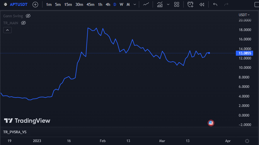
Take for example Aptos, shown below. This is the price action through 2023, and it is easy to see that it went up, came down, and is now ranging about. Reading a chart from right to left is easy, but to try and predict how the line will go from left to right, we need to pick up more clues.
To do this on Trading View (TV), we add lines using the ‘Trend Line‘ from ‘Trend Line Tools‘onto the chart. The objective is to fit the price action as well as you can, similar to high school science classes where we drew a ‘Line of Best Fit‘. In general, the fewer lines the better, and they should touch as many of the points where price pivots as possible.
Here is Aptos again, with two trend lines and a key level.
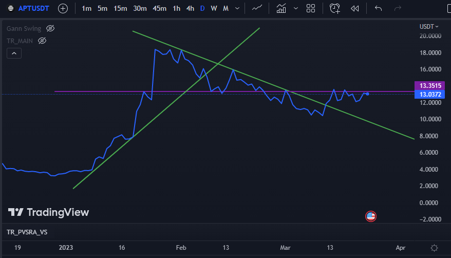
Just three extra lines give us a lot of help in working out what has happened, and what might happen next.
As it hits the trend from underneath, it requires a lot of confidence (buying volume) to push through and continue to head up. If this does not happen, selling overtakes buying and the price will drop. This repeats until eventually the trend is broken, and when that happens there will often be a ‘breakout‘. Buyers who had waited until the trend was broken jump in, and sellers dry up, leading to a sudden pop in price. We can see this happening at Point 3.
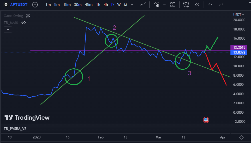
The opposite happens too, where a price will bounce along a trendline using it as support, and eventually the support gives way, leading to a sudden flood of selling and a price drop. This happens at Point 2, where the first weak bounce signalled limited momentum and was followed by losing support and dropping in price.
Contact with these trend lines can often serve as little launchpads though; where the trend line provides support and buyers flood in to take advantage. Strong rallies often begin with the confidence from holding trendlines, and Point 1 shows a great example of this.
These trendlines are also useful for identifying patterns, which we will cover as well in future, but to start with simply play around with adding lines to the charts where they make sense to you. One excellent thing about learning how to chart is that future price action will tell you how good your lines were. On services like TV, the lines are automatically saved, and it is incredibly satisfying to come back randomly at a later point and see that price stopped or bounced exactly at your previously drawn trend line.
Candlestick Charts
Up until now, we have been using line charts, which are intuitive and accessible but leave out a lot of information. Line charts plot the closing price (of a given time period) only – smoothing the data and removing most of the noise[1] . A lot of trading is about pulling signal from the noise, however, and most traders prefer to use candlestick charts.
These were conceived in Japan over 250 years ago by Japanese rice trader Munehisa Homma and have been staples of financial markets for at least the last 150 years. The idea is to visualise the range of prices over a period whilst also showing where the price mainly stayed, which gives clues to the psychology and momentum of the market. They are comprised of two parts; body and wick.
The body starts at the opening price for that time period and finishes at the closing price. If the opening price was higher the candle will be red, to signify selling, and if the closing price was higher then the candle will be green, signifying buying. Do note that some people use white and black, or various other custom schemes, but the basic idea remains the same. The wicks extend out from the body to show the highest and lowest sale prices within that period, giving a visual idea of the range.
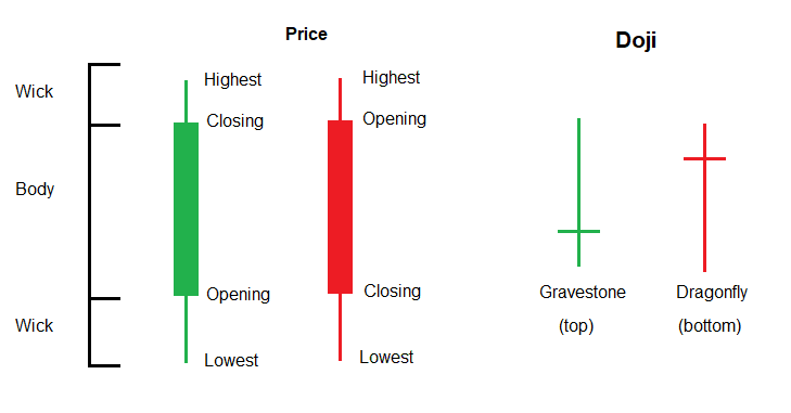
How do we use these? Well, there is a school of TA that puts a lot of weight into how individual candles look, and there are more candle types and sequences than there are subatomic particles. Feel free to explore this more yourself, but the most important one to know is a ‘Doji‘, which often appears at a bottom or a top, where price ranges further with the trend and then retreats to the opening price by its close. This is a good example of how we can use candlesticks more generally – to show exhaustion.
A wick can be thought of as a region where there were more buyers than sellers or sellers than buyers, and their exhaustion (of liquidity) allowed the price to get beaten back to the body. Below are some examples where this information can be helpful.
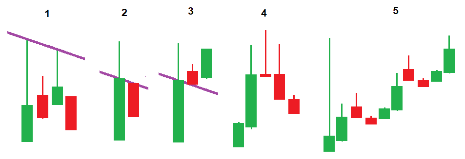
1 – Price touches the trend line with long wicks, but the bodies do not approach the trend line. This shows there is a lot of selling at the trend resistance and it will likely reject.
2 – Price gets through a trend line, but without good buying volume, it was beaten back below by sellers. These are fake breakouts and are often little more than stop hunts.
3 – Contrasting number 2, this shows a healthy trend break out, where buyers have come in to buy the trend line.
4 – This shows a Doji signalling a top, but you can also see that the candles nearby have long wicks and bodies holding a single price. Long wicks are a key clue to helping to confirm bottoms and tops.
5 – Lastly, after large events (such as randomly pumping or scary world news), you will often see large wicks going well beyond the recent range. Someone has been smashing the market buy/sell button, and it got all the way to there before buyers/sellers were found. This is by no means gospel, but such wicks often need to ‘resolve‘, so in this case price has floated towards the wick level before coming back down after revisiting it.
Please also note that when we are drawing trend lines, most people use candlesticks and place the trends on the extreme wicks (and not the bodies). As we saw in example number 2, sometimes price wicks through trend lines, so just try to fit it as well as possible (even if one or two wicks poke through a little, especially on lower timeframes). Another trick is to do the trend line with the line chart, and then again with wicks, giving you a band where resistance or support will be found.
That‘s all for this edition. Next time we‘ll be covering some of the handiest indicators that you really need to know about.


