This article offers a quick technical overview of Polkadot’s Dot token, potential outlook, and positives/negatives. The Dot token was voted on by my twitter followers by popular demand.
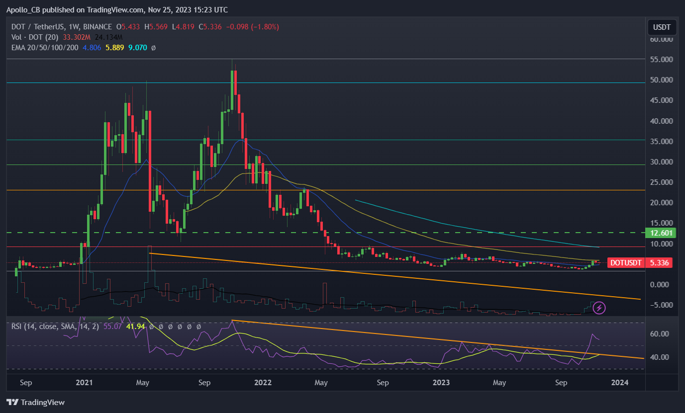
Polkadot Weekly Chart
Dot has been struggling since the crypto market crash last September. While many tokens or narratives are on an uptrend, dot has remained stagnant. Looking at my chart below, you will notice a precipitous drop in volume that most of crypto realized. The RSI has taken a nosedive as well. There is a recent uptick but that can be applied to entire altcoin market. For a quick recap on Polkadot check out our article [here].
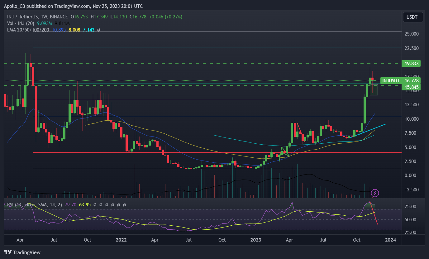
The token has been ranging between the two Fibonacci levels noted with the gray and red lines. Fibonacci’s are very important when evaluating the strength of a token after a large and drawn out correction. You will notice stronger tokens are much further up the tiers. Below I added my chart on Inj, you will notice that he token is past the .5 fib and attempting to take all-time highs in the near future.
A long consolidation can potentially lead to a rather large rally, but there is an opportunity cost associated with sitting your cash in an asset that hasn’t moved for a long time frame. Needless to say, this weekly chart does not look bullish in my opinion but lets head over to my favorite time frame for crypto, the 4-hour chart.
This next image is a forming descending triangle which typically breaks to the downside. For more information on triangles check out Investopedia [here]. If you use the candle bodies for support which I prefer, and not the wicks this could be an upside breakout after contraction of volatility and price action. Contraction usually symbolizes that buyers and sellers are less and less willing to buy or sell further from current price. This uncertainty of future price tends to cause a large upside or downside move eventually.
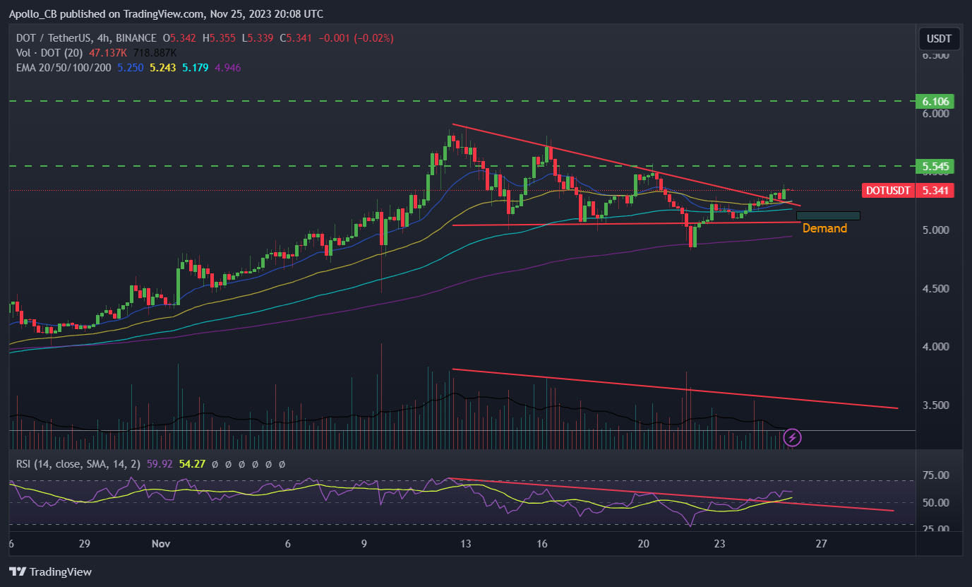
4-Hour Chart
If you use the candle wicks this triangle is still forming. Remember, longer-term time frames are always better for evaluating momentum and price action. I added a demand zone for supportive context. This demand is rather small, which also shows how not hot this token has been. There is something to say for trying to buy tokens when they are boring, so there is definitely potential. I personally have been completely out of Dot since I sold it last bullrun.
I also do not have any interest in getting back into the ecosystem for the time being. I have not seen much positive market psychology on the token which is my specialty. That said, the 20 and 50 exponential moving average have crossed to the upside so the token could be making a move short-term. I like exponential averages because they weight more recent days more heavily in the formula than a standard moving average. This helps catch onto a trend more quickly. Catching a trend reversal early is where the real money is made.
I think the most challenging thing that the ecosystem will face is the competition with the Cosmos ecosystem. Cosmos has nailed the interoperability on a very real level. It is near seamless to move from Osmosis to other chains and vice versa. This is partially why a lot of my crypto is stored on Cosmos and some of my larger holdings (Think INJ) are within the Direct Cosmos ecosystem. In summary, I am short-term bullish on Dot, but here are better momentum plays, and long-term bearish on Dot. Thanks for reading, stay safe out there!


