Technical Analysis: Indicators
We have already covered the basics of identifying trend lines and candlestick behavior, and there are plenty of traders who use only what we have already covered to successfully trade. This would be helped by knowing some chart patterns, which we will cover later but are only a quick Google away if you‘re interested now (and Apollo has just uploaded an article on bull flags [link] which is well worth a read.
However, as we are in the middle of another FOMO season, covering some of the key indicators that might save your portfolio seems wiser. There are thousands of diverse indicators, all with legions of fans and detractors, but there are some that are known and loved by almost all traders. Today we are going to cover two of the most used ones; Relative Strength Index (RSI) and Bollinger Bands (BB).
The following example (produced using Cryptowatch instead of TV) includes both RSI and BB on the currency pair GBP/USD on an hourly timeframe. Have a look at the chart, and see if you can intuit what the two indicators can help you identify.
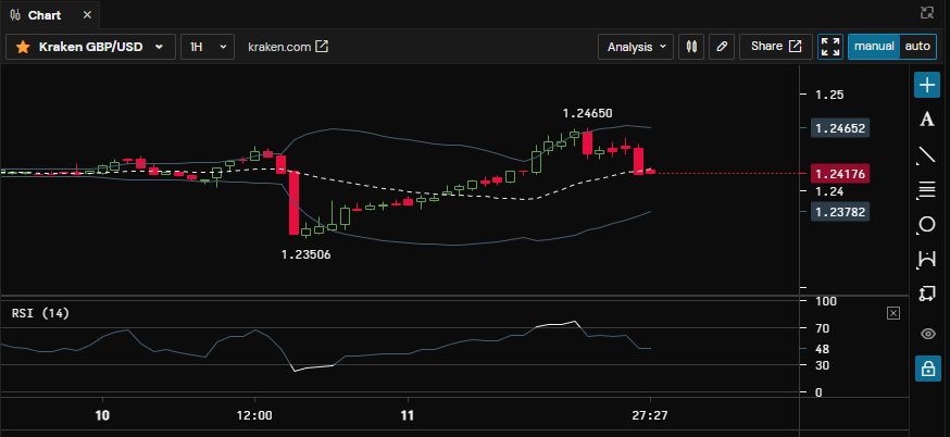
If you guessed that these indicators both help to spot if something is overbought or oversold, you‘d be correct. That is to say, this buying (or selling) is unsustainable, and a reversal is likely. Both indicators can give you more information than simply this, but this is a key use for both.
Indicators: Bollinger Bands
These are formed by combining a Moving Average (of the price), which is the middle line, with two standard deviations (a measure of variance) above and below that Moving Average to form the top and bottom bands [1].
In normal conditions, price will tend to range between the top and bottom band, sometimes using the middle line as support or resistance. This can give you useful buy and sell targets when trading. If a price is pushing against the top band, it is a sign that it might form a local top soon. This pushing can continue for a surprising amount of time, however, but if the price extends beyond the BB bands then it tends to reverse soon after.
The distance between the lines can help you judge the potential future moves, as when the price is merely ranging the BB will remain narrow, but higher volatility (wild swings up or down) will increase the width of the BB. The BB can give you a target for a so-called ‘dead cat bounce‘, which often retraces to the midline (mean reversion) after a big dump.
The angle of the bands can also be useful; with a 45-degree angle upwards showing an uptrend, a 45-degree downwards showing a downtrend, and a flat horizontal showing some general consolidation. Using just the BB on this timeframe in the above example we can see that, despite the volatility, there is no clear trend yet.
Relative Strength Index (RSI)
This momentum indicator uses the gain and loss of the last 14 periods to give a number between 1 to 100 [2] , where a number below 30 denotes oversold, and a number over 70 shows overbought. Whilst these levels are less valid in stronger trends (it can stay overbought for a long time in full FOMO season), they are important enough that most charting services will highlight them when they exceed the levels.
In our example above, you can see that the blue RSI line turned to white at the bottom of the first dump to 1.235 (when RSI was below 30), and also at the peak a day later at 1.246 (when RSI was above 70). Apparently a 0.8% move in Forex is quite exciting… In digital assets you would expect to see far bigger moves for such RSI responses, but the example still demonstrates the principle well.
Now, the RSI is a handy tool to time entries and exits, or at the very least to prevent bad entries and exits. It is seldom a good idea to buy a wildly overbought thing, for instance (but often a good idea to sell some). However, as noted it can be less reliable in a strong trend, where a strongly bullish asset could, for instance, spend a long time in the ‘deeply overbought‘ region whilst still having plenty of momentum left to push higher. In such cases, a pullback is also unlikely to reach oversold territories before continuing with the bullish trend.
Indicators: Divergence
But lastly, the thing that makes RSI such an important indicator to add to your toolbox – divergences. These, as the name suggests, are periods when the price and RSI diverge from one another. In normal circumstances, RSI should track price closely, with new highs in price also showing as new highs in the RSI. This shows a change in momentum before it is reflected in the price, giving you an early warning that the trend is liable to reverse. The following diagram shows the main divergences to keep an eye out for.
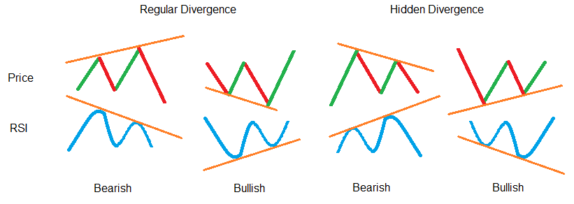
Although exaggerated to help convey the concept, they do often look as pronounced as this when encountered in the wild. Also, the key difference between regular and hidden divergence is when they occur. Regular divergence tends to show up following a strong sustained trend (such as marking the end of a month-long pump), whilst Hidden divergence tends to show the end of consolidation phases [source].
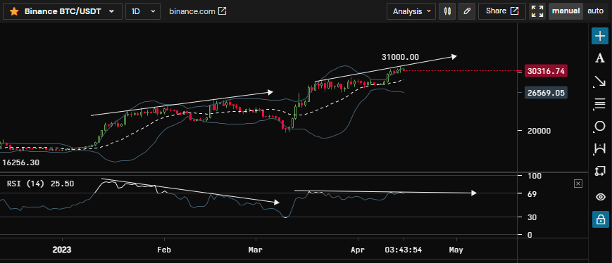
And just to show another timely example, here is the current BTC-USDT chart with a couple of divergences added. Let‘s see how this plays out.
With both of these indicators, care must be taken to use these in combination with other signals. They are also, depending on your time horizon and trading style, most reliable on higher timeframes. If you use these to time an entry or exit from a swing trade you will probably be most satisfied using the daily or higher timeframes. Bitcoin being oversold on the weekly might be a generational buying opportunity, whereas it being oversold on the 30-minute is what is commonly known as ‘Tuesday lunchtime‘.


